[EN]
ARKLINK™
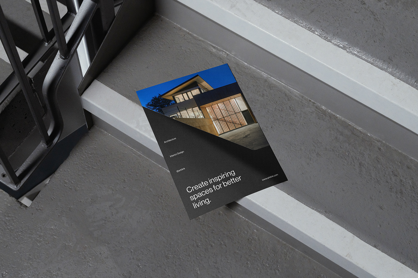
Create inspiring spaces for better living.
Established in 2015 as a Design and Build Architectural Firm based in Cebu, Philippines.
Create inspiring spaces for better living.
Established in 2015 as a Design and Build Architectural Firm based in Cebu, Philippines.
ARKLINK is a correlation between the Filipino word ARKITEKTURA and LINK, which their firm practices in an open setting and collaborative environment that connects information, experience, idea, and vision to produce creative and functional design solutions.
They consciously evolve and develop their architecture and construction services to bring value to their practice and the clients that they serve.
Client: Arklink | Service: Logo / Visual Identity | Year: 2022

[EN]
Creative concept
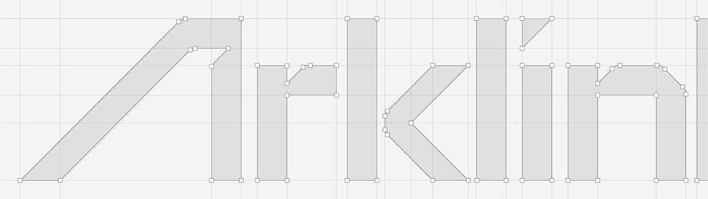
The Arlink logo is pretty simple yet memorable and eye-catching. The centerpiece of the design is the name of the brand, which is given in bold modern custom-made logotype that has geometric architectural shape.
It’s a modern design it’s bold and stylish, with clear bold confident lines. There is enough space between the letters, and it makes the logo more stable and balanced.
The first “A” of the logotype is geometrical, sleek and strong, it catches attention. The black color of the lettering represents the brand as the one that values quality and stability.
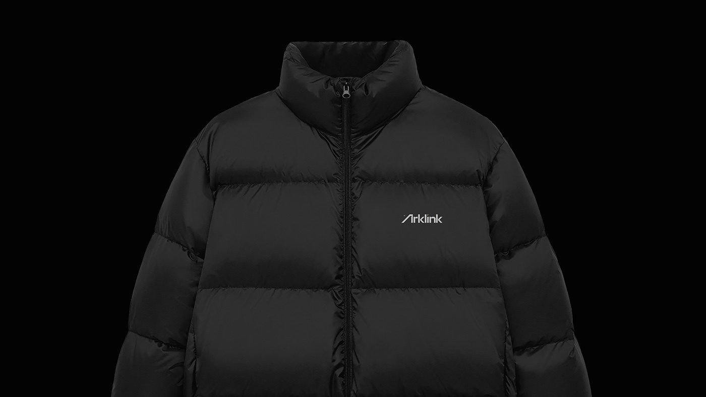
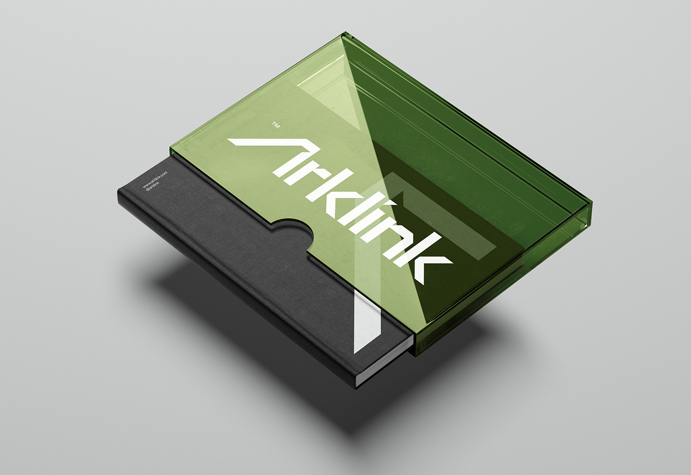
The Arklink visual identity is minimalist and modern. The timeless black, white, gray & Olive drab combination of the brand evokes a sense of power and trust to the brand. The choice of color emphasizes the idea of minimalism and refinement.